

Sevendos
Sevendos is a company formed by the collaboration of seven leading companies in the tech and design space. With a need for a new visual identity, the strategy documents provided a clear direction for creating a look that is both functional and tech-focused, yet airy and peaceful.
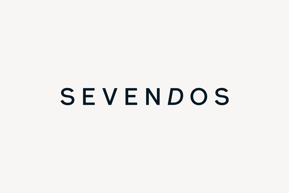
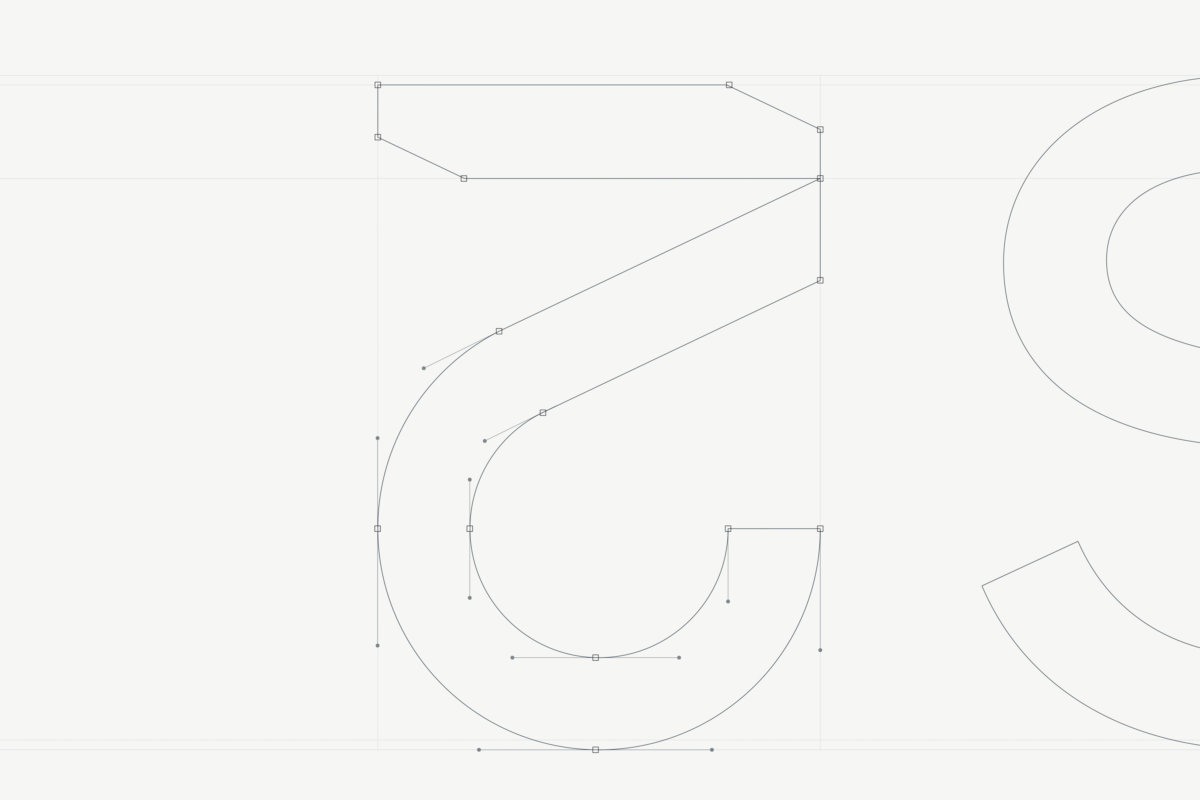
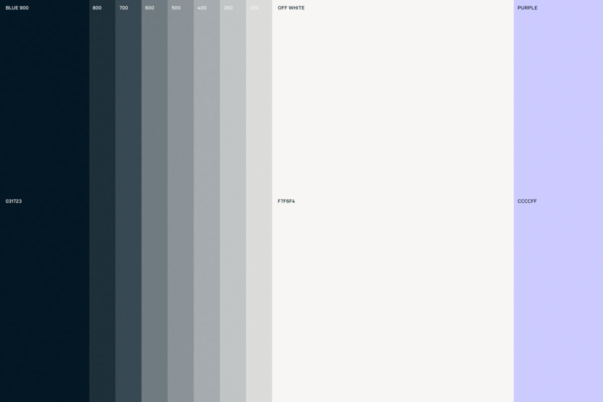
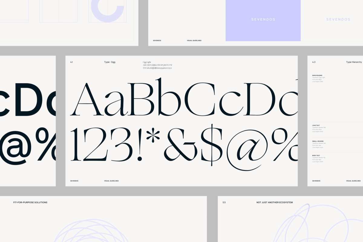
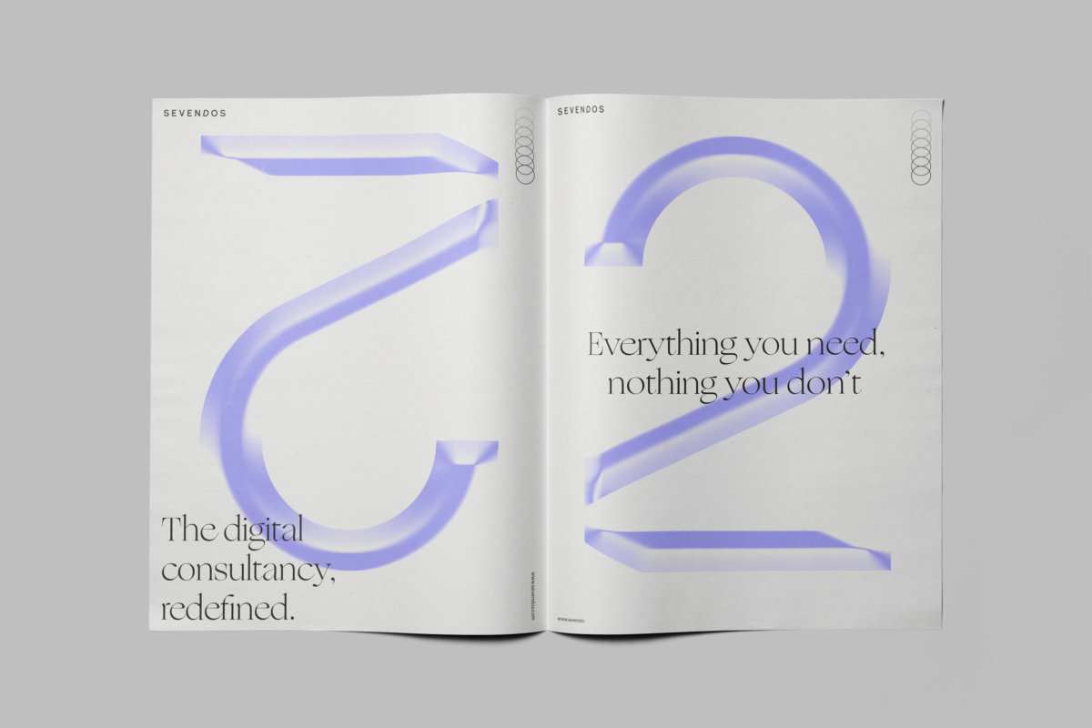
This new visual identity is defined by a limited color palette, elegant typography, and abstract line-art illustrations. These elements work together to create a clean and modern aesthetic that reflects the innovative nature of Sevendos. The logotype and marque are particularly significant, inspired by the name itself—Sevendos. This clever wordplay combines “Seven” (representing the seven founding companies) with “Dos” (Spanish for “two,” hinting at the two behind-the-scenes companies).
The result is a visual identity that not only captures the essence of Sevendos but also conveys its unique story and the collaborative spirit of its founders.
Agency: Wunderdog
Design direction & design: Graziano Monteleone
Animation: Teemu Vilen
Strategy: Adventure Club
